In the previous post we learned about data pre-processing. In this post we will review the simplest algorithm - Simple Linear Regression.
Business Problem: In this series, we are going to learn about Simple Linear Regression. We will review a data set about Salary and Experience in age. As a data scientist, your job is to help the HR department predict the salary of a person based on his years of experience if he or she accepts the job offer. If you offer too low, the person will not accept the job offer. If you offer too high, then you will be wasting the company’s resources($$).
Getting the dataset
What is Simple Linear regression?

If we draw a graph of salary vs Experience, you will see a linear trend.
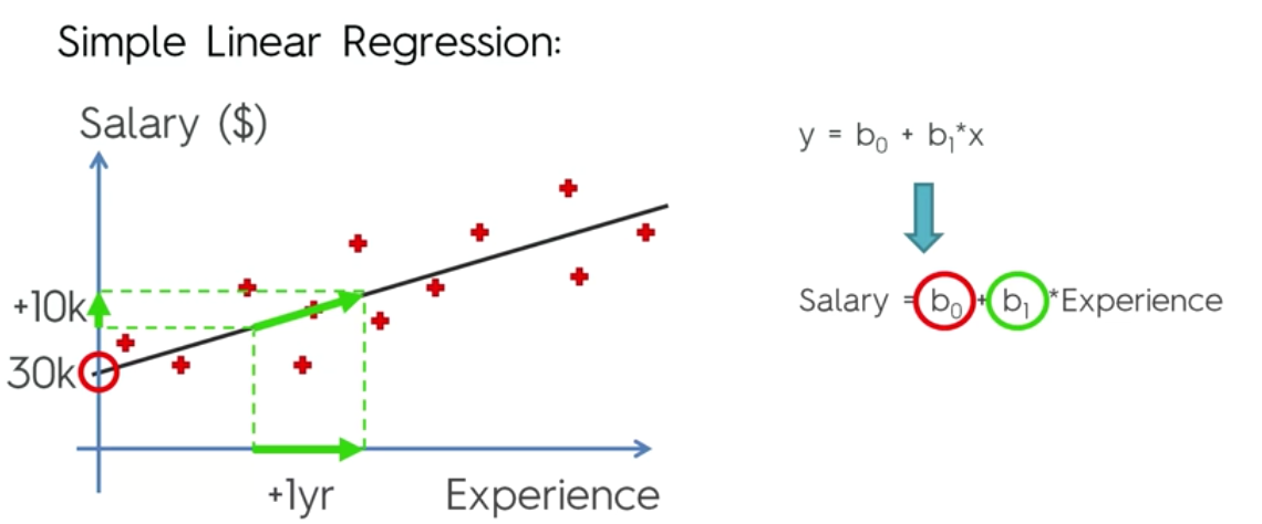
Based on the graph, it is clear that this is a positive slope. If the co-efficient b1 is big, the slope is going to steeper, which means that if there is a small increase in the age, then there will be a big increase in the salary. If the value of b1 is small, the slope is going to be more gentle and with change is experience, the salary is going to increase gently.
How is a trendline determined by a model?
The model tries to find the trendline by determining the least of Sum of errors. In the below diagram, imagine the red cross as observed value and green cross as determined value(model prediction). The algorithm finds the difference between the and squares them. The algorithm does this for all the observed values and determines the slope of trendline which given the minimum of SUM(y - y^)2

Steps to solve the problem.
- Step 1: Data Preprocessing
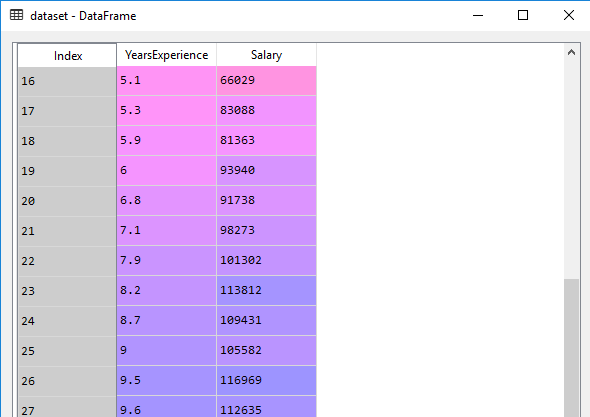
We will follow the same process as we did in the first series. We will import the libraries and read the csv file and take a look at the data.
|
|
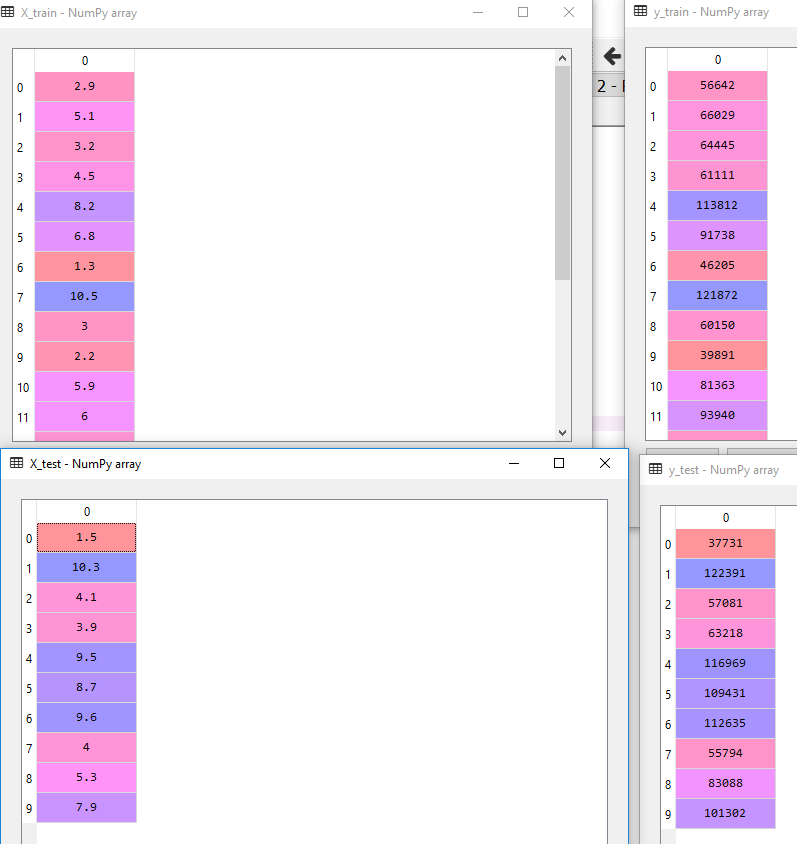
- Step 2: Split the data into training and test data
Since there are 30 rows, we will divide the data in 20:10(training:test)
|
|
-
Step 3: Feature Scaling
We won’t be feature scaling or normalizing here because the library that will execute the model takes care of it. So we are going to skip this step. -
Step 4: Train the model
At this point our data pre-processing is complete and we will use the library to run the regression on the training data set.
|
|
LinearRegression(copy_X=True, fit_intercept=True, n_jobs=None,
         normalize=False)
In the above code, we have trained our model and saved it in the variable regressor.
- Step 5: Predict and compare with the actual test set
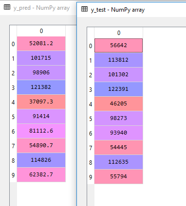
Next, we are going to predict the values of the test sample and get the predicted results in variable y_pred.
|
|
Let’s see how did the model predict.
- Step 5: Plot the data
To better understand, let’s create plot the trendline of our model and look for two things
- What is the fit of trendline for training data?
- What is the fit of trendline on test data against predicted values?
|
|

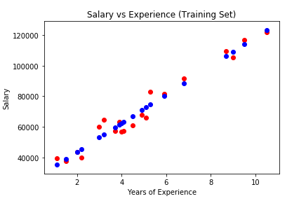
Here’s how the graph would like for Training data

Couple of things to note. The scatter function just plots the x,y values on the graph as red dots
plt.scatter(X_train, y_train, color=‘red’)
The plot function also maps the data as blue dots but it joins them via line starting from first mapping to the last. Additionally, you will also notice that in the y-axis, we have passed model function predict(X_train) and not predict(x_test) because we want to use the function created using the training set - y=mx+c.
plt.plot(X_train, regressor.predict(X_train), color=‘blue’)
Plot vs Scatter
The primary difference of plt.scatter from plt.plot is that it can be used to create scatter plots where the properties of each individual point (size, face color, edge color, etc.) can be individually controlled or mapped to data.
The purpose of the above code is to show trendline against the training data points(red dots). If we wanted to show predicted line as set plotted dots, we would have used
plt.scatter(X_train, regressor.predict(X_train), color=‘blue’)
In that case the graph would have looked like this.
Here’s how the graph would like for Test data
|
|


As explained earlier, the trend line is what the model was trained against the training data set. Hence
plt.plot(X_train, regressor.predict(X_train), color=‘blue’)
and not
plt.plot(X_test, regressor.predict(X_test), color=‘blue’)
Now let’s create a more complete picture - the training set(RED DOTS), test set(GREEN DOTS) and predicted value (BLACK DOTS).
|
|

So you will notice that all the black dots lie on the trend line because they are created using the trendline equation.
That’s it. We just trained a model using Simple linear regression and predicted the values, then compared it against test data.
|
|