So far in the series we have learned about forms on regression models. Each of those models was used to solve a target variable that was a linear number.
Now we enter a territory where target variables might not be that straight forward. The target variables would be in the form binary, category, etc. Basically anything other than a number. Ex - Cat vs Dog, Yes or No, Reg, Green or Blue.
This form of machine learning is called Classification. One of the first algorithms in this series is called Logistic Regression
Goal: We are provided a set of data that contains, Gender, Age, Salary & Purchased. The goal is to predict whether a person will make a purchase given the parameters - Age and Salary.
Data Exploration
1
2
3
|
import numpy as np
import pandas as pd
import matplotlib.pyplot as plt
|
1
2
|
#Load the file
dataset = pd.read_csv("Social_Network_Ads.csv")
|
1
2
|
#View the first 5 rows
dataset.head()
|
|
User ID |
Gender |
Age |
EstimatedSalary |
Purchased |
| 0 |
15624510 |
Male |
19 |
19000 |
0 |
| 1 |
15810944 |
Male |
35 |
20000 |
0 |
| 2 |
15668575 |
Female |
26 |
43000 |
0 |
| 3 |
15603246 |
Female |
27 |
57000 |
0 |
| 4 |
15804002 |
Male |
19 |
76000 |
0 |
1
2
|
male= dataset[dataset['Gender']=='Male']['Gender'].size
females = dataset[dataset['Gender']=='Female']['Gender'].size
|
1
2
3
4
5
|
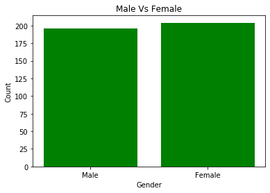
#Plot male vs female?
gender = ['Male', 'Female']
y_pos = np.arange(2)
gender_count = [male, females]
x_pos = [i for i, _ in enumerate(gender)] # 0,1
|
1
2
3
4
5
6
7
8
9
|
plt.bar(x_pos, gender_count, color='green')
plt.xlabel("Gender")
plt.ylabel("Count")
plt.title("Male Vs Female")

plt.xticks(x_pos, gender) ##==> ([0,1], [Male, Female])

plt.show()
|
1
2
3
4
5
|
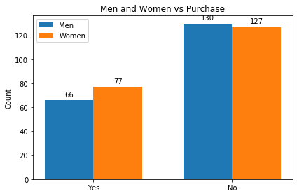
#How many Men vs Female bought/Not Bought
men_purchase = dataset[(dataset['Purchased']==1) & (dataset['Gender']=='Male')]['Gender'].size
men_no_purchase = dataset[(dataset['Purchased']==0) & (dataset['Gender']=='Male')]['Gender'].size
female_purchase = dataset[(dataset['Purchased']==1) & (dataset['Gender']=='Female')]['Gender'].size
female_no_purchase = dataset[(dataset['Purchased']==0) & (dataset['Gender']=='Female')]['Gender'].size
|
 1
 2
 3
 4
 5
 6
 7
 8
 9
10
11
12
13
14
15
16
17
18
19
20
21
22
23
24
25
26
27
28
29
30
31
32
|
x_label=['Yes', 'No']
x_pos = np.arange(len(x_label))
width = 0.35
people_purchase = [men_purchase, men_no_purchase]
people_no_purchase=[female_purchase,female_no_purchase]
#All people
fig, ax = plt.subplots()
rects1 = ax.bar(x_pos - width/2, people_purchase, width, label='Men')
rects2 = ax.bar(x_pos + width/2, people_no_purchase, width, label='Women')

ax.set_ylabel('Count')
ax.set_title('Men and Women vs Purchase')
ax.set_xticks(x_pos)
ax.set_xticklabels(x_label)
ax.legend()

def autolabel(rects):
    """Attach a text label above each bar in *rects*, displaying its height."""
    for rect in rects:
        height = rect.get_height()
        ax.annotate('{}'.format(height),
                    xy=(rect.get_x() + rect.get_width() / 2, height),
                    xytext=(0, 3),  # 3 points vertical offset
                    textcoords="offset points",
                    ha='center', va='bottom')

autolabel(rects1)
autolabel(rects2)

fig.tight_layout()

plt.show()
|
 1
 2
 3
 4
 5
 6
 7
 8
 9
10
11
12
13
14
15
16
17
18
19
|
# What age range purchases more
men_purchased=dataset[(dataset['Purchased']==1)& (dataset['Gender']=='Male') ]['Age']
female_purchased=dataset[(dataset['Purchased']==1)& (dataset['Gender']=='Female') ]['Age']

n_bins = 6

fig, axs = plt.subplots(2,1, sharey=True)

# We can set the number of bins with the `bins` kwarg
#plt.title('Men Vs women Salary Range Purchase')
axs[0].hist(men_purchased, bins=n_bins,orientation ='vertical',cumulative=True )
axs[0].set_ylabel('Men Purchases')


axs[1].hist(female_purchased, bins=n_bins,orientation ='vertical',cumulative=True)
axs[1].set_ylabel('Female Purchases')
axs[1].set_xlabel('Age Range')
#fig.tight_layout()
plt.show()
|
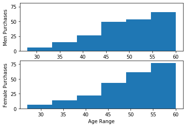
For people who bought, it appears that men and women’s shopping habit is quite different. For both men and women, they make purchases gradually until age 40. After age 40, both men and women tend to purchase more. After age 50, men purchase habits drop but women continue the trend.
 1
 2
 3
 4
 5
 6
 7
 8
 9
10
11
12
13
14
15
16
17
18
19
|
# What salary range purchases more
men_purchased=dataset[(dataset['Purchased']==1)& (dataset['Gender']=='Male') ]['EstimatedSalary']
female_purchased=dataset[(dataset['Purchased']==1)& (dataset['Gender']=='Female') ]['EstimatedSalary']

n_bins = 12

fig, axs = plt.subplots(2,1, sharey=True)

# We can set the number of bins with the `bins` kwarg
#plt.title('Men Vs women Salary Range Purchase')
axs[0].hist(men_purchased, bins=n_bins,orientation ='vertical' )
axs[0].set_ylabel('Men Purchases')


axs[1].hist(female_purchased, bins=n_bins,orientation ='vertical')
axs[1].set_ylabel('Female Purchases')
axs[1].set_xlabel('Salary Range')
#fig.tight_layout()
plt.show()
|
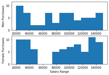
Salary Range purchases are more interesting. Men’s and women’s purchases keep dropping from 19000 - 50000. Women’s purchases continue to increase from 75000 and upwards. Men’s purchases remain pretty stale beyond 70000 and upwards.
Set up Training and Test Data
1
2
3
4
|
# Set up training and test data
x=dataset.iloc[:,1:4].values
y=dataset.iloc[:,4:5].values
x[1:5]
|
1
2
3
4
|
    array([['Male', 35, 20000],
           ['Female', 26, 43000],
           ['Female', 27, 57000],
           ['Male', 19, 76000]], dtype=object)
|
The dataset has a categorical field sex = {Male, Female}. Before we proceed to train the model, let’s encode the dataset.
 1
 2
 3
 4
 5
 6
 7
 8
 9
10
11
12
13
14
15
16
|
#Adding the logistic regression
from sklearn.preprocessing import OneHotEncoder, LabelEncoder

from sklearn.compose import ColumnTransformer

transformer = ColumnTransformer(
    transformers=[
        ("Gender",        # Just a name
         OneHotEncoder(categories='auto'), # The transformer class
         [0]            # The column(s) to be applied on.
         )
    ], remainder='passthrough'
)

x= transformer.fit_transform(x)
x
|
1
2
3
4
5
6
7
|
    array([[0.0, 1.0, 19, 19000],
           [0.0, 1.0, 35, 20000],
           [1.0, 0.0, 26, 43000],
           ...,
           [1.0, 0.0, 50, 20000],
           [0.0, 1.0, 36, 33000],
           [1.0, 0.0, 49, 36000]], dtype=object)
|
Now you can see that Male has been set to 0,1 and Female as 1,0.
Next, we split the data in tp train and test data. Here we are splitting into 75:25 ratio. The random_state is set to 10, which means that every 10th row will be set to train and test.
1
2
3
|
#Split into training and test data
from sklearn.model_selection import train_test_split
X_train, X_test, y_train, y_test = train_test_split(x, y, test_size=0.25, random_state=10)
|
Next, we will standardize the value across the dataset. Standardized scaling is an important step here because as you will see the age range is between 1-100, while salary is in the 1000’s and sex is either 0 or 1.
1
2
|
from sklearn.linear_model import LogisticRegression
from sklearn.preprocessing import StandardScaler
|
1
2
3
|
sc = StandardScaler()
X_train = sc.fit_transform(X_train)
X_test = sc.transform(X_test)
|
1
2
3
4
5
6
7
|
    array([[-1.06191317,  1.06191317, -0.93894518,  0.26049952],
           [ 0.94169658, -0.94169658, -0.93894518,  0.43327002],
           [ 0.94169658, -0.94169658,  0.3177076 ,  0.05893394],
           ...,
           [-1.06191317,  1.06191317, -0.84227958,  0.2892946 ],
           [ 0.94169658, -0.94169658,  0.1243764 , -0.25781198],
           [ 0.94169658, -0.94169658,  0.4143732 ,  1.09555693]])
|
Now you can see that each column has been standardized and scaled. Next, we need to define our regression class.
1
2
|
lr = LogisticRegression(random_state=3, solver = 'lbfgs',\
                        multi_class='auto').fit(X_train, y_train.ravel())
|
1
|
y_pred = lr.predict(X_test)
|
After training our Logistics Regression, we tested it against the test data to see what are values predicted for untrained data from the test.
Next, we need to see our accuracy and look at the Confusion matrix
1
2
3
|
from sklearn.metrics import accuracy_score, confusion_matrix
print('Accuracy: \n' , accuracy_score(y_test,y_pred))
print('Confusion Matrix:\n' ,confusion_matrix(y_test,y_pred))
|
    Accuracy:
     0.9
    Confusion Matrix:
     [[64  5]
     [ 5 26]]m
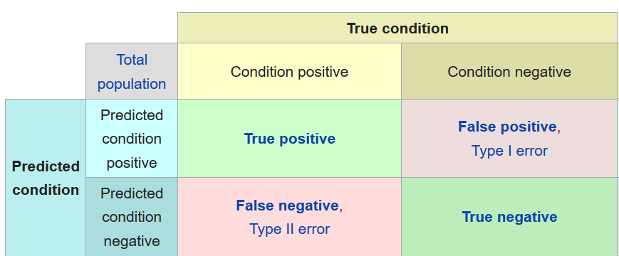
And with this, we can see that our accuracy is 91% and 10 items (5 False Positive and 5 False Negative) were incorrect predictions